Creating a Design Education for the 21st Century: Part Two
Continual Iteration
When I became curriculum director, I chose to treat the design of the Designation program as I would any product. It just so happened that Designation’s was an educational product. Prior to joining Designation, I was design director at Discovery Communications, where I spent the previous few years incubating strategic products for the company. What I decided to do with Designation was to bring the same product design approach that I had cultivated at Discovery to the bootcamp.
Even though the needs of Designation’s students were different from a consumer or a viewer of Discovery’s channels, I felt confident that I could still find a way to create an effective solution by constantly experimenting and evaluating the curriculum using an iterative design approach. I would later discover that this approach already had a name and was gaining traction in the educational industry; it was called learning experience design.
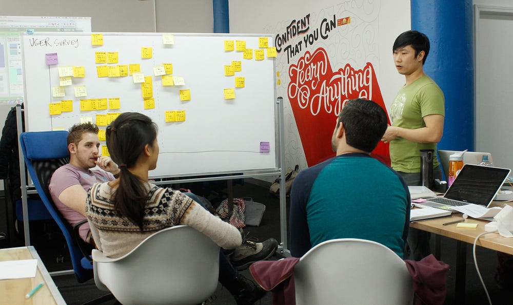
One of the unique opportunities of teaching at Designation was that a new cohort started the program once every 4 to 6 weeks. This meant that I would have an opportunity to iterate and collect data from my experiments at a rapid pace. Each cohort represented a new set of guinea pigs for my trials, and it gave me a chance to learn quickly.
Gathering Data
In order to better assess what was working and what wasn’t working in the curriculum, I knew that I needed data. Designation had already been conducting exit interviews from graduating students as well as collecting alumni hiring statistics, but it didn’t have anything else. And all of the exit interviews from the previous three cohorts weren’t transcribed and stored anywhere where I could access them. So I knew that I needed to install a process for gathering the additional sources of data that I needed in order to quantify how the program was doing and to measure the efficacy of my changes.
The first form of data collection that I introduced was surveys; they were easy to administer and I could use the results to see patterns within and between cohorts. Most importantly, I was able to ask students to respond anonymously, to provide unfettered feedback.
One of the challenges with the exit interviews was that it was conducted by a student-facing staff member, which made it difficult for students to always be completely forthright, particularly, if they had negative feelings. My hope was that the survey would liberate students to be more open and honest about their pain points. Additionally, the surveys allowed the staff to be held more accountable for their own performance, particularly on the instructor side.

The survey results weren’t always pretty, but it gave me a baseline for comparison. The first survey that I introduced was a post-virtual survey that asked students to self assess their abilities and their experience with the virtual phase. One of the key data points that I was most interested in was whether all of the additional assignments I was adding was overwhelming to students.
Virtual Preparation
For background, the virtual phase is a period where students spend 6 weeks working remotely, prior to joining the bootcamp in-person, doing some preliminary coursework. The first incarnation of this content was a PDF that was emailed to students. This version predated my time, but the workload consisted mostly of watching Lynda videos and doing a few design-related exercises.

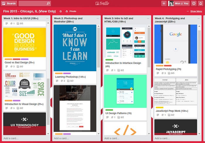
By the time I joined Designation, the virtual content had already moved from being a PDF to being hosted on Trello, and the students posted their work on a private Google+ community. In order to make sure the workload wasn’t too overwhelming, I asked students via a post-virtual survey to assess the difficulty of the workload. I supplemented this data with in-person interviews, and I tracked student performance on the assignments.
What was most interesting was that no matter how much work I seemed to put into the virtual phase, the students almost always felt like it was the “right amount of content”. My interpretation of this result was that students appreciated having more to learn even if it meant spending more time in advance of the in-person phase. This was a win for me, because I knew that the students who had more experience prior to coming into the bootcamp performed better. Now, I had a means of giving all of my students that additional preparation and experience.
The second survey that I introduced was a post-immersion survey. The Immersion phase was a span of four weeks during the program which featured daily workshops led by myself and nightly lectures with part-time instructors. Initially, the post-immersion survey asked students to evaluate the instructors and to provide optional comments. Over time, I would experiment with the types of questions asked, and it provided me with one of the largest data sets to use as a basis for my iteration. Using both the survey results and the exit interviews, I was able to begin to evaluate what was working in the curriculum.
Understanding The Students
The Designation students are always a motley bunch; no two cohorts are ever the same. Students come from all walks of life, and each have a different story to tell. Over time, I was able to identify common traits within the student body. These key student attributes led me to define student personas. The main archetypes were what I would call career switchers, career advancers, and career starters. The main goal of all of these students were to graduate and get a job as a designer.

The career advancer was someone usually in their 30s but could be older, who had relevant work experience, but wanted to take their skills and career to the next level. These students were professional graphic designers, consultants, IT professionals, etc. In the case of a graphic designer, for example, they may have been working in print and wanted to transition into becoming a digital designer. These were some of my best students, as they usually had a good foundation of hard and soft skills coming into the program. They knew what kind of career path they wanted to pursue, and they had a high level of motivation. Their main challenges, however, were balancing life and work on top of their bootcamp studies, and it may have been a while since they had to study and do coursework.
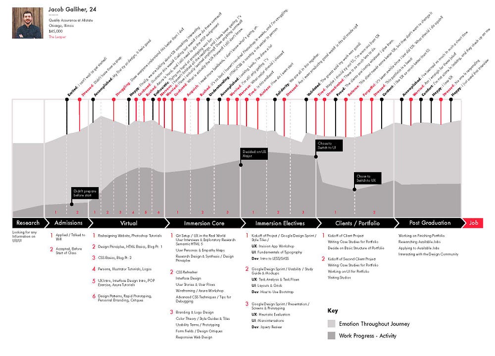
The second class of students were career switchers. These were people, usually in their late 20's, who were coming from an unrelated profession, but had at least a few years of work experience. In many cases, these students already had a solid career path, before deciding to switch professions in pursuit of something more creative and fulfilling. Both the career advancers and career switchers were typically college graduates, and both possessed a solid base of soft skills. In the case of the career switcher, however, their most salient challenges were learning a new suite of concepts, terminology, software and skills, all the while balancing work obligations and personal relationships.
The final classification of students were who I would call career starters. They were typically in their early to mid 20’s. In some cases, they had just graduated college or in some instances, were still in college. If they were employed, they hadn’t yet found a career track. They usually had little to no design or other related career experience. These students hadn’t figured out what they wanted to be, whether that was UX or UI design or front-end development. They needed more guidance and most importantly, lacked soft skills.
Their strongest reference point for education was traditional academia, and being millennials, they were digital natives, which meant that what they lacked in soft skills, they made up for with their fluency in technology and implicit understanding of digital patterns. These students usually needed lots of individualized feedback and craved more clarity when being given creative direction.
By no means were these personas a definitive classification; there was a lot of fluidity between them among the students. Many students were a mixture of more than one. However, creating these personas helped me to understand who the students were and what challenges they faced. Regardless of their persona, all of the students shared a common goal: everyone wanted to start a new career as a UX or UI designer.
In order to serve the career goals of our students, we needed to make sure:
- Students understood core concepts and key methods.
- Students had project experience they could include in a portfolio.
- Students developed proficiency in the main software used in the industry.
These program requirements were already in place when I joined Designation, and my goal was to find the best way to meet these objectives using a student-centered design approach.
The Evolution of the Curriculum
During my time as curriculum director, I experimented with everything from seating arrangements to scheduling of topics to student team pairings. In my previous article, I wrote about some of the changes that I first introduced into the classroom phase. Over time, I experimented with almost every form of pedagogy imaginable. I tried:
- Flipped classroom model
- Project-based learning
- Lectures
- Blended approach
- Competency-based learning
- Cooperative learning
- Distance learning
- Problem-based learning
Practice Over Theory
Some of the early feedback that we received was that students loved the content of the UX lectures but really wanted more opportunities to practice them. They were vague on the UX process and when to use the different methodologies. Assignments were good but they felt like they weren’t receiving timely feedback, if any, from the night-time instructors.

The trend was pretty clear. Students wanted more practical knowledge over theory. For the first 8 cohorts, I used a different exercise, specific to a topic everyday. For instance, one day the students may have been asked to create an exploratory research plan, and then on another, they were asked to create a responsive design for a website template that I provided.
While these daily exercises were useful and practical, they fundamentally failed to show students how to apply all of the methods together for a single project. Students liked the day-time activities, but wanted more time to work on them. And generally, the most common request was to have more chances to apply what they were learning in a facilitated group setting.
Project-Based Learning
The principle book that was used to teach the UX design process originally was Designing for the Digital Age by Kim Goodwin. The approach taught in this book is goal-directed design, first introduced by Cooper. Since the book was already assigned as reading, I wanted to see if I could have the students experience this approach within the scope of a project. I took a Cooper exercise called LocalGuide, which the students had previously been given as homework by Zeke, the UX instructor, and turned it into a series of assignments that built on top of each other, alongside reading the book.

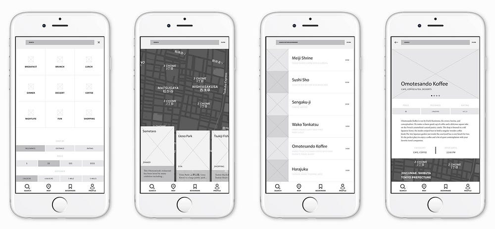
The LocalGuide exercise already included example user interviews from Cooper, so I asked the students to create personas based on the provided research, then define the product requirements and user tasks. This then led to sketching and prototyping, and ultimately creating a high-fidelity visual design. These series of day-time homework were largely successful in helping students gain a stronger grasp of key UX principles. So I began to wonder if I could have students experience this process even sooner. Could it be given as homework during the virtual phase?
The answer was yes…for the most part. The biggest downside that I saw was that students failed to see a connection between the reading and the assignments that were given. For some reason, the students didn’t understand that the LocalGuide assignments were mirroring the process that the book was describing, but in small scale. As I would come to learn much later on, it turned out that at the root of this misunderstanding was many of the students weren’t actually reading all of the chapters in the book, much to my chagrin.
The chief complaint from students was that they didn’t feel they had enough time to do all of the virtual assignments, and that the reading didn’t seem relevant because they weren’t being tested on that knowledge. It was clear that I would need a solution to address this issue, but the fact that I was able to have students go through the entire process virtually was a win. Rather than a fractured set of homework with no connection with one another, students could now experience the basic steps involved in a user-centered design process, even if it wasn’t on a conscious level.

Design Thinking
Since I validated that the single project assignments could be effective, I decided to see if I could expand it even further. Instead of using the goal-directed design process, I chose to focus on design thinking. The reason why I chose design thinking was that it was an easy process to understand, and there is a wealth of freely available resources provided by the d.school on the subject. And last but not least, it was gaining popularity and had a lot of cachet because of Ideo and Stanford’s reputation.
Previously, we had used a single day exercise on design thinking called “Redesigning the Grocery Experience” as a way to introduce students to the user-centered design approach. Students had a lot of fun with that exercise, and they were disappointed when they learned that they wouldn’t be able to follow through on their concepts. So I wanted to see if I could use the design thinking approach as a framework for all of the day-time activities during Immersion.
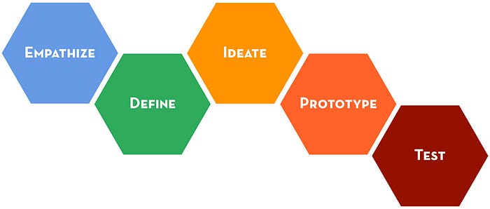
Instead of using LocalGuide or the grocery experience, I created a new prompt: create a way for people to buy organic food. Every day-time exercise followed the design thinking approach. Whereas in the past, the students were given a single assignment divorced from the rest, I now asked them to create a research plan for this prompt. Then I had students form groups and conduct interviews with one another as practice. Then I asked them to formulate personas and customer journey maps. The next day I asked them to develop problem statements, and brainstorm concepts that they could paper prototype and test.
Gradually, I started to introduce more and more UX methods to complement the process they were learning. Student comprehension and satisfaction with the content improved, because they now understood how a user-centered approach worked holistically. They weren’t being asked to figure out for themselves how all of the pieces fit together. I felt that I had successfully bridged the connection between real-world projects and the classroom assignments, creating more clarity about the UX process and gaining more investment on the part of the students.
Challenges to Project-Based Learning
Inner Team Dynamics
Originally, I decided to have the students work in teams for their project prompt for three main reasons:
- I wanted the students to divide and conquer, because of the enormous amount of work involved with the prompt in such a short amount of time. Having every student conduct enough user interviews and usability testing on their own would have been onerous and taken exponentially longer.
- One of the continuing trends that I had seen in the exit interviews and surveys were students reporting how much they appreciated learning through group activities. One of the strongest positives reported by students about the Designation experience was the sense of community and camaraderie that the program fostered, so it seemed to make sense then to encourage students to learn from one another with a cooperative project.
- My final rationale had to do with the feasibility of managing students and their work for all of their deliverables. It simply was too difficult to try to give individualized attention to every student and their specific deliverables on a daily manner. The amount of people power required to attend to so many students would be nearly impossible from an instructor standpoint. However, if the students are working in teams, it makes the review process more manageable, because then you’re dealing with deliverables as a bundle rather than as an atom.
Despite the benefits of this project-based approach, there were some immediate unintended consequences to switching to this cooperative group-based model. The biggest pain point that arose was managing inner team conflicts. The increased emphasis on collaboration meant that if there were personality conflicts, then it became a major impediment to everyone involved.
I discovered early on that forming the right team of students was an important ingredient to the class’ success. I had to keep track and monitor personalities and anticipate potential clashes between students. While I like to think that I was more successful than not, it was an imperfect science. The only hard and fast rule that I ever had was to try to evenly disperse my best students across the different teams.
Experiments in Student Management
I would go on to experiment with many different tactics for team management. One early experiment was to have designated student project leaders, but this quickly proved to be problematic, because some students misunderstood their role and fancied themselves to be their team’s creative director. These students would dominate their teams with their own ideas and try to impose their own creative vision on their peers. My original hope was to have them focus on project management and delegation of responsibilities, but not every team leader knew how to perform that function, so it was almost an immediate non-starter.
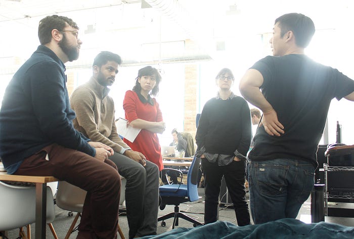
Next, I tried placing myself as the projects’ creative director and chief project manager. I ruled all of my warring student factions with an iron fist. There was no mistaking who had the final say, which temporarily addressed the issue of student conflict. It didn’t eliminate all of the internal bickering, but it quieted some of the strife. However, this was only a temporary measure and an imperfect one at that, because the internal conflicts never went away, and it would rear its ugly head again when it came time for client projects. In one instance, a student cried when she learned that she would have to work with someone she didn’t get along with.
Having students work in teams made the students’ experience with the program much more dependent on their experience with their project group. Students began to complain more vociferously about the difference in skill level among their peers, the difference in their work ethic, their difference in working styles, their difference in communication preferences, etc. This conflict was most pitched between our career advancers and career starters. Career starters hadn’t yet cultivated the necessary life experience to learn how to work in a professional manner. And career advancers felt like they had to babysit their team members, which distracted them from furthering their own development.
With all of these issues, it may have been easy to revert back to more individualized assignments and classwork, but ultimately, we, at Designation, decided that in order to be successful as a UX or UI designer, the students needed to learn how to collaborate and communicate with a variety of people. So it was important from the program’s standpoint to help our students learn how to cultivate this ability.
To begin to address this matter, we introduced a series of soft skills workshops as well as utilize more designers-in-residence to help manage the student teams on the ground-level. It’s impossible for an instructor to be in more than one place at one time, so to help monitor all of the teams’ dynamics, we recruited the designers-in-residence to be an extra set of eyes and ears for our instructors and of course, to provide added support to the students. This didn’t solve all of the problems, but it helped move the program in the right direction.
Misadventures in Project Management
Another challenge to working within a project-based model was now we had to deal with project management issues, like managing scope, planning out sprints, delegating responsibilities, scheduling and keeping students accountable for their deliverables, performing creative reviews, etc.
The project timeline that I instituted for the project was a kind of variation on the Google design sprint. The project was divided into a series of weekly design sprints to help students rapidly ideate, prototype, and test their concepts.
Since the program taught both UX and UI, instead of following a strict double diamond model, I introduced what I called a triple diamond approach.

The first half of the project worked like a standard diverging and converging design process, but when the UX deliverables were finished, this then led to a visual design process. This process began with moodboards, finding inspiration, doing visual competitive analysis. This initial phase was about gathering lots of information and exploring a divergent set of styles. The second part of the UI process entailed refining the design and converging towards a polished set of designs, with a clear set of deliverables such as mock-ups, responsive designs, a style guide, a UI kit, and so on.
One of the difficulties of using my so-called triple diamond approach was that to ensure that the students got through the entire process, the project had to be managed very tightly. There was very little margin for error, and therein lied the rub. With the design thinking approach, it’s not unexpected to have concepts fail. That’s a natural part of the process. You fail early and often and you iterate on your designs.
Unfortunately, what ended up happening was that students failed so much in the beginning they found themselves iterating on their wireframes and prototypes endlessly, leaving little time left over for visual design and refinement. This led to students openly complaining about the program underserving visual and UI design needs. We would try many different tactics to address this issue, but what became clear to me was that it was impossible to try to teach both UX and UI equally well within the limited space of time that we had for the classroom phase, which was 6 weeks.

Now, one potential solution to address this issue was to expand the classroom phase, but then it would have cut into what is arguably the most valuable part of the program which is working with real clients. And moreover, students were already complaining that they didn’t have enough time in the back half of the program, specifically as it related to building their portfolios.
So we had a choice: we could either increase the length of the in-person phase of the program from 12 weeks to 16 or more, which would significantly increase the cost or we would need to change how the program worked. Given these two choices, my solution was to come to a kind of compromise where I extended the length of the virtual phase of the program while also making changes to the program structure.
A New Hope
Through my many trials and experiments, I felt like I had finally arrived at a structure that mirrored the user-centered design process well. And even though the project-based approach had its challenges, it made sense to try to preserve it, because the challenges the students were facing would be the same kinds of challenges they would have to deal with in a professional design environment. Managing tight deadlines, working with colleagues of differing skill levels and communication styles are all real challenges that designers face everyday. To me, it was now a matter of how to prepare my students to deal with these challenges more effectively.
The first major overhaul I made was to remove front-end development from the program. You can read my thinking behind that decision in this other article. But in a nut shell, I wanted to build more time into the program to allow students to learn soft skills, become proficient in their chosen specialization, and to have more time to work on their portfolios.
A person who spends just two weeks learning HTML/CSS can’t really say they are proficient in those skills anyways. Usually, most of my students would forget much of what they learned by the end of the program, because they weren’t continually practicing and applying that knowledge.

Next, I forced students to choose an area of specialization sooner, be it UX or UI. This was done for a variety of reasons, but one of them was to help our career starters and career switchers have more time to develop proficiency in their designated discipline. By separating these two tracks, it guaranteed that our UI students would have ample time to work on their visual design skills and to have enough built-in project time to improve their mastery.
Moreover, from the program standpoint, it was nearly impossible to find instructors who were equally good at teaching both UX and UI concepts anyways, and when we did try two different instructors, coordination and communication between them became problematic and difficult to manage. Students complained about receiving contradicting feedback from the instructors and the differing levels of expectations on the deliverables and the project’s goals. Two separate tracks meant we wouldn’t have to deal this issue anymore, and the program would be easier to staff.
Lastly, having students specialize reduced the volume of software that our students would need to learn. UX designers don’t typically need to be masters of Photoshop and Illustrator. Conversely, UI designers aren’t expected to be pros at Omnigraffle, Axure, and other UX software. This specialization allowed students to focus on the main tools they would need to become good at.
The other major decision I made was to have students spend more time on their virtual preparation. Over the course of my many experiments, I knew that students could go through a user-centered design approach virtually. The biggest issue was comprehension of the theory based on the reading. When students didn’t read all of the books or articles assigned to them, the principle complaint was always the same: they didn’t have enough time. The benefit of expanding the program virtually was that we could mitigate increases in cost both to the students and the program, and simultaneously, give the extra time that students said they needed.

The first phase of the new online preparation course was an iteration on the previous virtual Trello content. It was a series of project-based assignments that allowed students to experience both UX and UI design in a single course. The second part of the online program was an immersive virtual course which drilled deeper into an area of specialization and reinforced the learning from the first half.
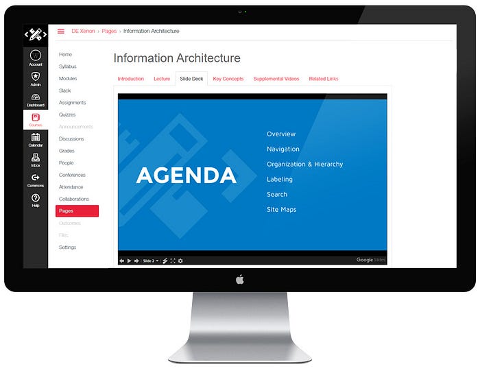
Finally and perhaps, most importantly, my last act as curriculum director was to migrate all of our entire educational content into a true learning management system (LMS). This transition provided some distinct advantages:
- Student analytics: we now had a powerful tool to visualize our students’ engagement with our material. We could approximate how much time students were investing into their coursework. How many views our videos were getting? How late a homework was submitted? How many minutes a student spent on our LMS.
- Centralized content repository: all of our slide decks, articles, reference materials, and assignments could be managed in a single place.
- Assessments: we could now deliver quizzes and grade assignments in a single platform.
- Flipped classroom model: using a LMS meant that it would be easier to utilize a flipped classroom model to facilitate learning. We could incorporate more embedded video content to communicate concepts.
The introduction of the LMS was not without its own challenges and lessons, but overall, I’ve been encouraged by the early results.
Final Chapter
Now that my time at Designation has come to an end, I can reflect on my journey and the work that I did in the bootcamp. It wasn’t always a smooth ride, but one of the things that I take great pride in is how relentlessly we iterated on the program. I don’t believe there’s a bootcamp anywhere in the world that has iterated as much as we have during my tenure.
Of course, this was not without its own drawbacks; there were mistakes that were certainly made. But I’m proud of how the program and curriculum has evolved. And as the program continues to grow in my absence, I feel confident in the culture that I’m leaving behind, a culture of constant introspection, analysis, and iteration. No matter what the future brings, I firmly believe this culture of constant adaptation and improvement will lead to Designation’s continued success. We aren’t just a UX/UI bootcamp. We are a bootcamp that practices what we preach.
P.S.
To all of my former students who are reading this, hit me up if you finally want the answer to who was the best cohort.

